

GROWTH
WITHIN
REACH
Reimagining how students find experiential learning opportunities on PeopleGrove.

Timeline
4 Weeks
Role
UX/UI Designer
Focus Areas
Order Flow | Item Customization | Menu Discovery
PROJECT OVERVIEW
PeopleGrove is a student development platform that helps prepare students for the workforce immediately following graduation. During this academic capstone project, completed through Western Governors University in collaboration with PeopleGrove, I applied user-centered design principles to enhance the platform’s usability and accessibility—helping address the long-standing challenge of bridging the gap between classroom learning and the real-world experience needed to confidently enter the workforce.
“How might we help students confidently discover, apply for, and track experiential learning opportunities on PeopleGrove?”
REQUIREMENTS AND DELIVERABLES
During this four-week design sprint aimed at improving PeopleGrove’s opportunity discovery and application experience, I focused on establishing the foundational mobile experience for the platform’s experiential learning feature.
The project deliverables included:
User Research Summary & Feedback Analysis
Persona, Empathy Map, and Journey Map
Low-Fidelity Mobile Wireframes
The project’s scope centered on designing early mobile concepts to support future rounds of usability testing and high-fidelity design iterations.
SKIP AHEAD: Research | Empathy Maps | App Designs | Final Insights
UNDERSTANDING THE STUDENT EXPERIENCE
PRIMARY RESEARCH INSIGHTS
To understand how students interact with PeopleGrove, I conducted a brief usability study with three participants representing different perspectives:
Maya, a busy graduate student
Jordan, a career changer
Sam, an environmentally minded undergraduate
Each participant was asked to find and apply to an experiential learning opportunity, then complete a short survey on:
Clarity of the Apply button
How opportunities were saved and revisited
How progress was tracked
Desired filters and company information
These insights shaped the persona, empathy map, and journey map that informed the design decisions that followed.
Insufficient Filters — Search filters lacked depth; students wanted options for values, job type, and pay transparency.
Disconnected Saving Flow — Saved opportunities didn’t sync with application tracking, making progress difficult to manage.
Ultimately, the research highlighted the need for a more intuitive, confidence-building experience—one that helps students stay informed, organized, and motivated as they search for real-world opportunities.
KEY PAIN POINTS
User feedback revealed five recurring issues impacting the student experience:
Unclear “Apply” Button — The main CTA labeled “Website” created confusion about whether students were applying or being redirected.
Manual Progress Tracking — Students had to track applications themselves, causing frustration and inconsistency.
Limited Company Information — Users wanted employer context (mission, values, culture) without leaving the platform.
DEFINING WHAT MATTERS MOST
How can design create a more seamless student experience?
To answer this question, I translated research insights into empathy-driven artifacts that capture how students think, feel, and navigate the platform. These included a persona, empathy map, and journey map—each representing common frustrations and opportunities for improvement uncovered during research.
Meet Alexis Carter
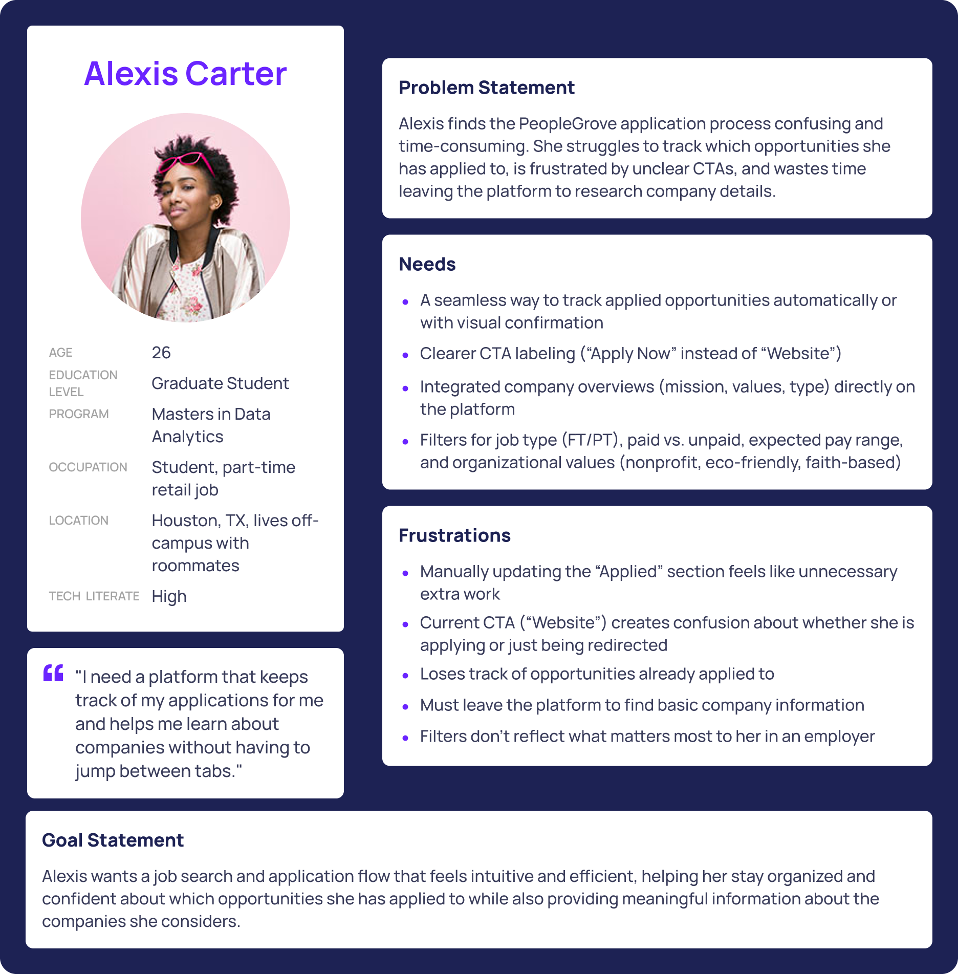
Graduate Student | 26 | Career-Oriented & Overwhelmed
Alexis represents the common challenges students face when navigating PeopleGrove. She’s balancing graduate school and career preparation, but the opportunity process feels disjointed.
She often forgets to manually track applied jobs, questions whether the “Website” button actually logs progress, and wastes time researching companies elsewhere.
Her needs are simple but crucial:
Clear CTAs
Automatic tracking
Better filters
Built-in company insights.
Ultimately, she wants efficiency and confidence from a platform that helps her stay organized, not one that adds more work.
Empathy Map

To capture Alexis’s mindset more holistically, I developed an empathy map that visualizes what she says, thinks, does, and feels while navigating the platform.
Says: “The ‘Website’ button is confusing.” “Applied doesn’t feel useful.”
Thinks: Wonders if she’s wasting time or using the tool incorrectly.
Does: Saves roles to Favorites, researches companies externally, and keeps manual tracking lists.
Feels: Frustrated and uncertain, yet hopeful when opportunities align with her values—such as nonprofit or eco-friendly organizations.
This map also revealed a key truth: students actually want to use PeopleGrove—they just need it to work for them.
Journey Map
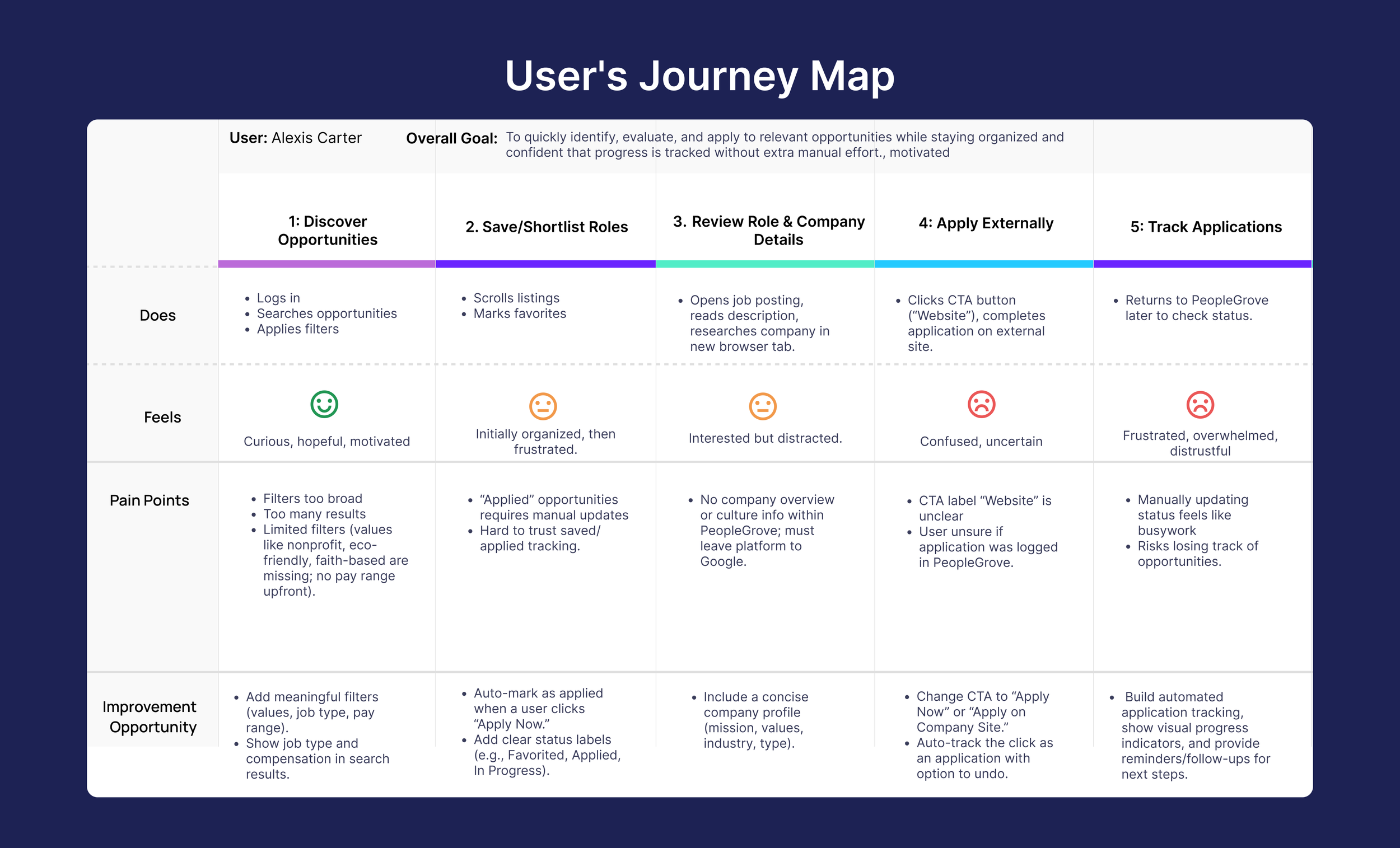
Building on the empathy map insights, I created a journey map to visualize Alexis’s experience from discovery to application tracking. The map highlighted key moments of frustration and opportunities for design improvement.
Search: Starts optimistic but feels limited by filters that don’t reflect her values or needs.
Save: Uses Favorites to stay organized, but manual tracking feels disconnected and unreliable.
Review: Spends extra time researching companies externally due to missing information.
Apply: The vague “Website” button causes confusion about whether her application was logged.
Track: Loses visibility into progress once she leaves the platform, leaving her frustrated and disorganized.
Across every stage, Alexis’s experience revealed one consistent theme: students want clarity, automation, and confidence.
These insights guided my design direction, inspiring solutions like improved filters, automatic tracking, company overviews, and clearer calls-to-action.
DESIGNING THE FOUNDATIONAL MOBILE EXPERIENCE
MOBILE APP DESIGNS
Home
The Home screen is intentionally simple and action-oriented. The header includes quick access to core needs — notifications for timely updates, a menu revealing application status, and a logo that doubles as a home anchor.
The primary focus is Recommended Opportunities, giving students immediate direction the moment they log in. By reducing visual noise and surfacing relevant options first, the Home screen sets the tone for a more guided and confident search experience.
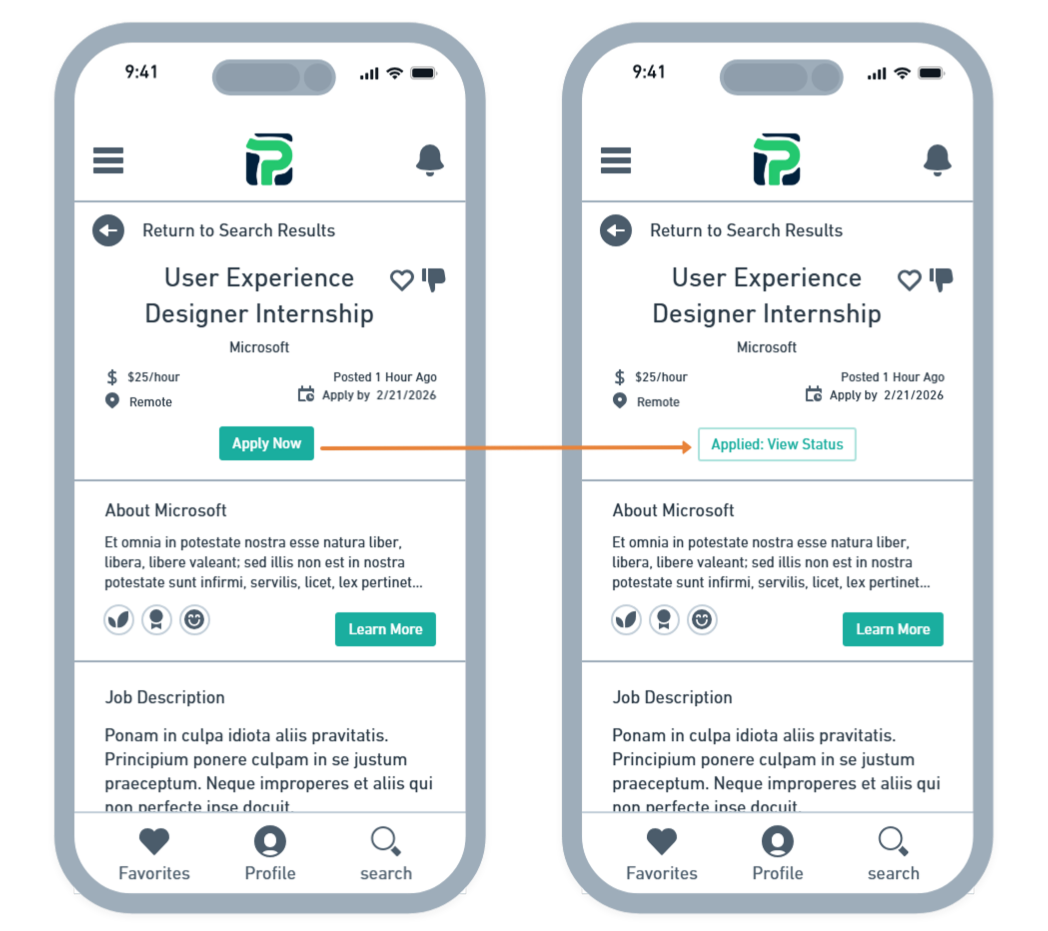
Opportunity Details
The Opportunity Details screen replaces the vague Website button with a clear, action-oriented Apply Now CTA.
When selected, the application is automatically added to the student’s Applied list, eliminating the need for manual tracking and reducing the risk of losing progress.
This update gives students clarity and confidence, ensuring they always know where they stand in their application journey.
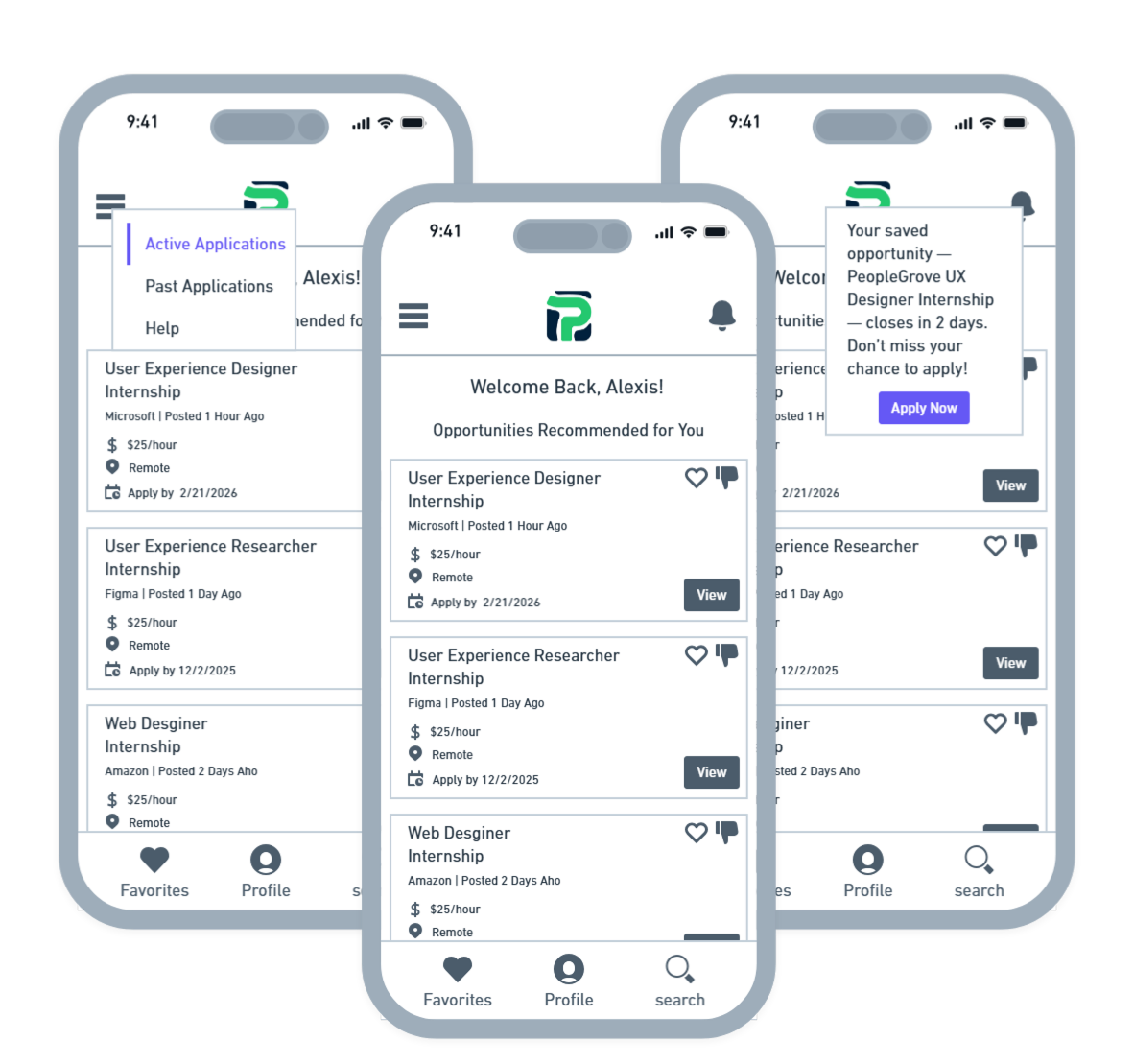
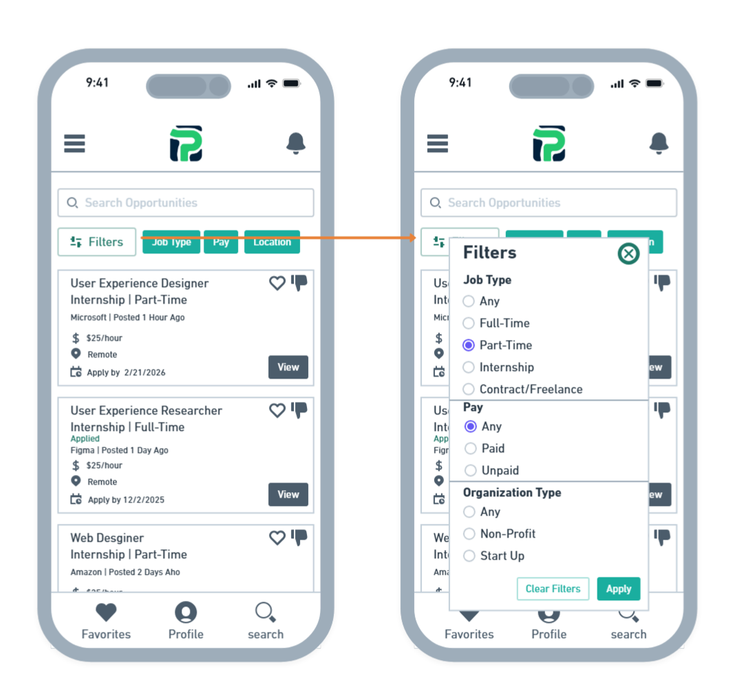
Search
The Search screen helps students quickly narrow their options with meaningful filters like job type, compensation, location, and organization type (e.g., nonprofit or startup).
Each opportunity card also supports like/dislike interactions, allowing the system to personalize future recommendations.
Roles the student has already applied to are clearly marked with an Applied tag, reducing confusion and helping them stay organized as they move through multiple opportunities.
Each stage of the journey revealed clear opportunities to improve the student experience — from more relevant filters and stronger CTAs to automatic progress tracking and integrated company insights. These insights shaped the blueprint for my wireframes, informing a focused redesign of four key mobile screens: Home, Search, Opportunity Details, and Company Overview. By simplifying navigation and elevating clarity at every step, the redesigned flow builds confidence and supports students throughout their application journey.
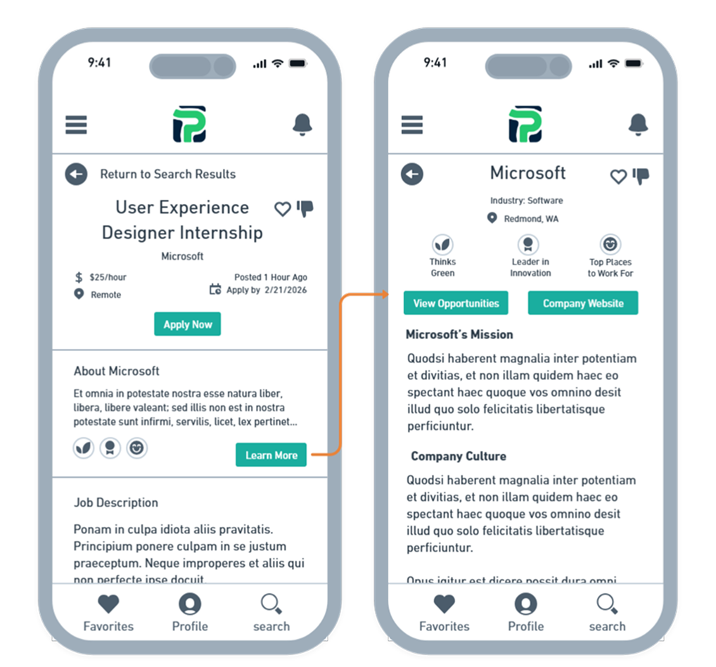
Company Overview
The Company Overview screen gives students deeper context before applying. By selecting Learn More, they can explore the organization’s mission, culture, and key strengths, presented through easy-to-scan badges.
From here, students can visit the company website or browse additional roles from the same employer.
They can also like or dislike the company—liking surfaces future opportunities from that employer, while disliking hides them—ensuring their recommendations stay relevant and aligned with their interests.
Together, these redesigned screens create a more guided, transparent, and confidence-building experience. By simplifying decisions, clarifying next steps, and personalizing recommendations, the new flow helps students move from discovery to application with far less friction. The result is a mobile experience that feels intuitive, supportive, and aligned with how students naturally navigate their search for opportunities.
FINAL INSIGHTS
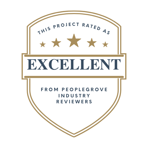
Upon submission, these foundational mobile designs received an Excellent rating from PeopleGrove, who praised the attention to detail and holistic understanding of the student journey. Their feedback affirmed the focus on clarity, personalization, and guided support. The improvements below show how research insights shaped meaningful features within the mobile experience.
Impact
In summary, these core improvements created the following enhancements:
A clear Apply Now button replaced the vague “Website” link, improving clarity and confidence.
Automatic application tracking reduced student effort and removed the need for manual lists.
Expanded filters aligned with real student priorities, including job type, pay, location, and organizational values.
A Company Overview page provided essential employer context without leaving the platform.
Like/dislike interactions personalized opportunities and employers, making recommendations more relevant over time.
Together, these updates create a mobile experience that is clearer, more intuitive, and better aligned with how students naturally search for opportunities.
Lessons Learned
Throughout this project, I gained a deeper appreciation for how much the details matter. Students want filters that reflect their real priorities—whether that’s nonprofit work, eco-friendly values, or specific role requirements. I also saw how small decisions, such as the wording of a button, can significantly influence a student’s confidence in the platform.
Automatic tracking stood out as a major trust-builder. When students no longer have to manually record their applications, the experience feels more reliable and supportive, reducing the cognitive load of managing their search.
Finally, creating empathy maps and journey maps helped me move beyond tasks and into the motivations, frustrations, and expectations that shape the student experience. That shift clarified what students truly need at each stage of their search and guided more meaningful design decisions.
Future Enhancements
In addition to the submitted designs, I also outlined several recommended next steps to further strengthen the project:
Enhanced application statuses to give students clearer visibility into their progress.
Smart notifications tied to saved opportunities and deadlines to support ongoing engagement.
Usability testing with a larger group of students to validate the experience and identify additional needs.
Expanded employer profiles and networking features to reinforce PeopleGrove’s role as both a career and community platform.
By pursuing these opportunities, PeopleGrove can build on this foundation and deliver an even more intuitive, engaging, and empowering experience for students